- First Signal: The resignation letter format is judged before anyone reads your words, clean layout reads as calm and professional.
- Non Negotiables: Use one inch margins, a classic font (Times New Roman, Arial, Calibri) at 11 to 12 pt, and clean spacing with clear section breaks.
- Basic Blueprint: Header contact block, full date, inside address, then 3 short paragraphs: Resignation plus last day, Gratitude, Handover support.
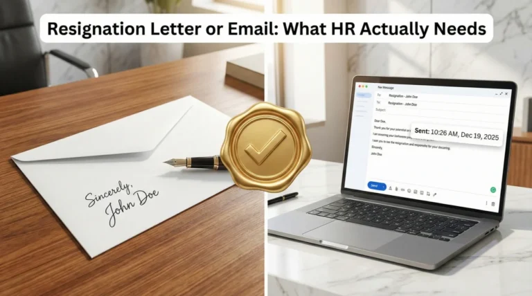
- Medium Choice: Printed or PDF looks most formal, email is faster, best practice is a short email with a PDF attached to preserve formatting.
- Avoid These Mistakes: Inconsistent spacing, “creative” fonts, dense wall paragraphs, and anything that reads messy on mobile.
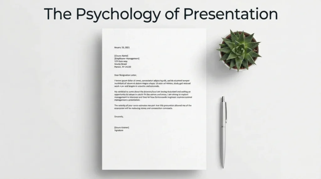
The Psychology of Presentation: Why Your Resignation Letter Format Matters
You have spent days agonizing over the right words. You have drafted, deleted, and rewritten your message to strike the perfect balance between gratitude and firmness. But here is the hard truth: before your manager reads a single word of your resignation, they judge how it looks. The visual presentation – the resignation letter format – is the very first signal you send about your professionalism during this critical transition.
Think of formatting as the “body language” of your document. A cramped, messy letter with tiny margins screams anxiety or carelessness. A well-spaced, clean layout with standard fonts whispers confidence, respect, and order. I have seen countless resignations where the content was gracious, but the chaotic formatting made the employee look disorganized right at the finish line. Conversely, a crisp, standard business letter reinforces your reputation as a competent professional who handles even difficult situations with grace.
In this deep dive, we are not just going to talk about margins and fonts; we are going to walk through how to construct a document that serves as the final, polished brick in the legacy you leave behind.
The Architecture of a Professional Letter
When we talk about business correspondence, we are really talking about standardization. This isn’t about stifling your creativity; it is about ensuring your letter is immediately readable and processable by Human Resources. Whether your letter ends up in a physical file cabinet or a digital archive, these technical specifications ensure it stands the test of time.
The Breathing Room: Managing Your Margins
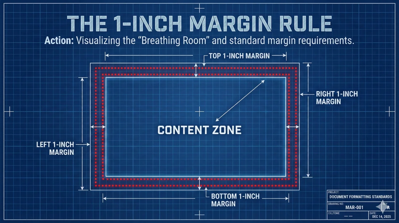
Let’s start with the empty space. It is tempting to shrink your margins to squeeze a long explanation onto a single page, but I urge you to resist that impulse. Proper resignation letter margins are the frame of your professional picture.
The golden rule is simple: one-inch (2.54 cm) margins on all four sides. Why is this specific measurement so critical?
- 🖨️ Printability: If your letter is printed, one-inch margins ensure that no text is cut off by the printer’s “dead zone” or lost in the binding of a personnel file.
- 👀 Readability: White space guides the eye. Margins smaller than one inch create a “wall of text” effect that feels overwhelming and aggressive to the reader.
- 📄 Standardization: It signals that you know the rules of the business world.
If you find yourself wrestling with the content to make it fit, don’t adjust the margins. Edit your words. A resignation letter should be concise. If you absolutely must write more, a well-formatted two-page letter is infinitely superior to a single page that looks like a terms of service agreement.
Typography: The Voice of Your Letter
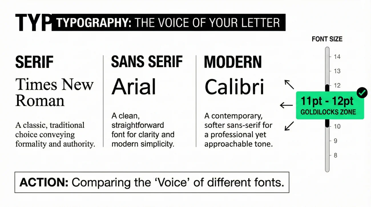
Your choice of font is the “voice” in which your letter is read. You want that voice to be clear, steady, and unemotional. This is not the place for personality; it is the place for clarity.
When selecting your typeface, stick to the classics. Times New Roman is the traditional “suit and tie” of fonts – formal, serious, and space-efficient. Arial offers a cleaner, more modern “business casual” vibe that is highly readable on screens. Calibri has become the contemporary standard for digital correspondence.
Equally important is the resignation letter font size. You need to hit the “Goldilocks” zone:
- 🚫 Too Small (10pt or below): It looks like you are hiding something or trying to bury the lead. It is also a nightmare for senior managers with aging eyesight.
- 🚫 Too Big (13pt or above): It looks juvenile, like a student trying to fill page count on an essay.
- ✅ Just Right (11pt – 12pt): This is the universal standard. It commands respect without shouting.
The Rhythm of White Space
Your resignation letter spacing dictates the rhythm of the reading experience. Professional business letters use a specific cadence: single spacing within paragraphs, and double spacing (a full blank line) between sections.
This separation serves a functional purpose. It allows the reader to quickly scan the document to find the critical data points: the resignation date, the last working day, and the signature. If you use 1.5 spacing throughout, the letter looks loose and draft-like. If you use single spacing without breaks, it becomes a dense block. The interplay of single-spaced text and double-spaced breaks creates a document that looks organized and intentional.
Blueprint of a Resignation Letter
Now that we have the technical settings configured, let’s build the structure. A formal letter follows a logical hierarchy that moves from “Who I Am” to “What I’m Doing” to “How We Move Forward.”
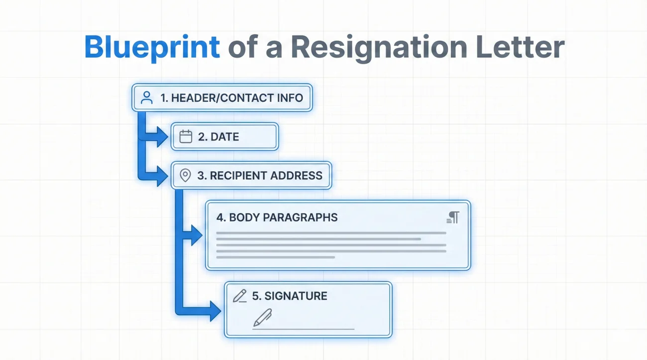
1. The Header: Identification
In the top left corner, you place your contact information. Even though your manager knows who you are, this document may be reviewed by HR specialists, payroll administrators, or legal consultants who don’t know you personally. Make their job easy.
Jonathan Doe
456 Corporate Lane, Apt 4B
Metropolis, NY 10012
(555) 019-2834
j.doe@email.com
Immediately following this block, add a double space, and then the date. Do not use “Today” or relative dates. Use the full format: “October 14, 2024.” This date is legally significant – it starts the clock on your notice period.
2. The Recipient: Formal Address
Two lines below the date, include the formal inside address. This might feel antiquated in the age of Slack and Zoom, but resignation is a formal contract termination. Treat it with the gravity of a legal document.
Amanda Smith
Director of Sales
Global Tech Solutions
789 Enterprise Blvd
Metropolis, NY 10014
3. The Body: Precision and Clarity
This is where many people stumble. They try to combine the notification, the thank you, and the transition plan into one massive paragraph. Don’t do that. Break it down logically. Understanding how to format a resignation letter means understanding how to segment your thoughts.
Paragraph 1: The Declaration. State clearly that you are resigning and give your final date. No fluff.
Paragraph 2: The Gratitude. Briefly mention a positive takeaway or express thanks. This preserves the relationship.
Paragraph 3: The Handoff. Explain how you will help during the remaining time.
Align all this text to the left. Never justify (block align) the text, as it creates weird gaps between words, and never center it. Left-aligned text is the easiest for the human eye to track.
Physical vs. Digital: Choosing Your Medium
We live in a hybrid world. While the gold standard is a printed letter handed over during a face-to-face meeting, reality often dictates an email or a PDF attachment. How do you choose, and how does the formatting shift?
| Feature | Printed / PDF Letter | Email Body Text |
|---|---|---|
| Header Info | Required (Full Address Block) | Omitted (Use Email Signature) |
| Date Position | Below Header | Top line (optional but recommended) |
| Signature | Handwritten above typed name | Typed name only |
| Formality Level | Highest (The Permanent Record) | Medium (The Quick Notice) |
If you send an email, I strongly recommend attaching a PDF version of your formal letter. The email body can be a summary (“Please accept the attached letter as formal notification…”), while the PDF ensures that your formatting remains intact regardless of what device or software the HR department uses to open it.
The Master Template: Putting It All Together
Let’s look at a complete example. Notice the balance of white space. Notice how the eye flows naturally from the contact info down to the signature. This is what “professional” looks like.
Robert Anderson
889 Highland Avenue
Seattle, WA 98101
(206) 555-0123
r.anderson@email.com
November 12, 2024
Elena Rodriguez
Chief Technology Officer
Innovate Systems Inc.
100 Tech Plaza
Seattle, WA 98104
Dear Ms. Rodriguez,
Please accept this letter as formal notification that I am resigning from my position as Senior Developer at Innovate Systems Inc. My last day will be Friday, November 26, 2024.
I want to express my sincere gratitude for the opportunity to have worked on the Cloud Migration Project over the past three years. I have enjoyed working with the engineering team and appreciate the professional development opportunities you have provided me.
During my final two weeks, I will focus on completing the documentation for the API integration and training Junior Developer James Miller to handle my current tickets. I am committed to ensuring a seamless handoff for the team.
I wish you and Innovate Systems Inc. continued success in the future.
Sincerely,
[Robert’s Signature]
Robert Anderson
Senior Developer
If you are looking for a starting point to build your own version of this, we have a robust collection of resources available. You can download a customizable resignation letter template that already has these margin and spacing settings pre-configured for you.
The “Red Flags” of Formatting
In my career, I’ve seen some truly baffling design choices. It is worth noting what not to do, because sometimes the best way to be right is simply to avoid being wrong.
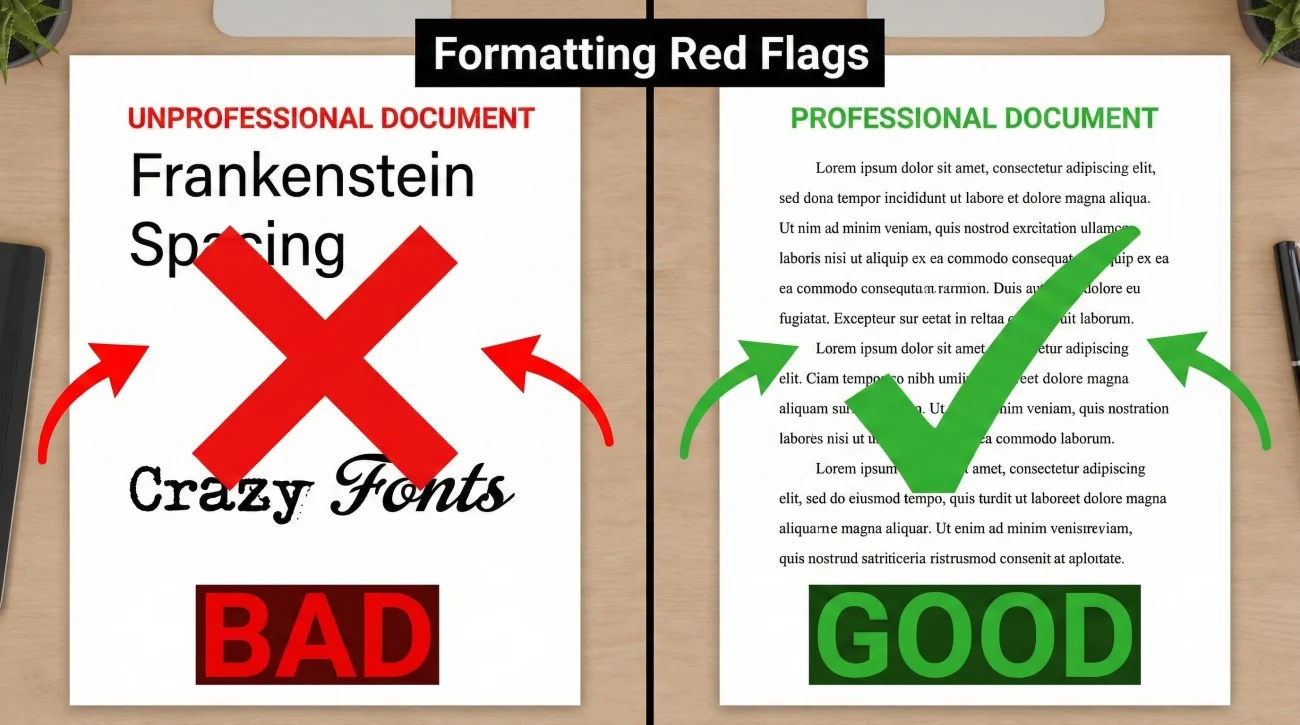
The “Frankenstein” Spacing
Nothing screams “copy-paste disaster” louder than inconsistent spacing. I often see letters where the first paragraph is single-spaced, but the second one has 1.5 spacing, likely because the writer pasted text from a different document. Select All (Ctrl+A) is your friend here. Ensure the formatting is uniform from top to bottom.
The “Personality” Trap
I once saw a resignation letter written in a font that looked like typewriter keys. The employee thought it looked “classic.” HR thought it looked like a ransom note. Stick to the standard fonts we discussed. If you work in a creative field – design, architecture, fashion – save the creativity for your portfolio. Your resignation should be boringly efficient.
Ignoring the Mobile Reality
If you are emailing your resignation, remember that your boss is likely reading it on an iPhone between meetings. Huge paragraphs look like unreadable walls on a small screen. Keep your paragraphs tight – three to four sentences max. This improves mobile readability without sacrificing formal structure.
❓ FAQ
📏 Can I adjust the margins if my letter is just a few lines too long?
I strongly advise against it. Shrinking margins to 0.5 inches makes the document look crowded and unprofessional. Instead, look at your content. Can you tighten a sentence? Remove a redundant phrase? Editing for brevity is better than breaking layout standards. If you absolutely must, a 0.8-inch margin is the bare minimum, but standard one-inch margins remain the expectation.
✒️ Should I sign a digital PDF resignation letter?
Yes, it adds a layer of professionalism and authenticity. You don’t need to print, sign, and scan, though. You can insert a digital image of your signature or use an e-signature tool. While a typed name is legally sufficient in most at-will employment contexts, a visual signature signals that you treat this as a formal document.
📑 What paper should I use if I am printing it?
If you are handing in a physical copy, paper quality is a subtle touch class. Use standard white or ivory bond paper (20lb or 24lb weight). Avoid standard printer paper if it’s flimsy or gray-ish, and definitely avoid colored paper. Crisp, bright white paper reinforces the clean, sharp resignation letter format we are aiming for.
📧 How do I handle the subject line in an email resignation?
Clarity is kindness. Don’t be vague with “Update” or “Chat?”. Use a subject line that leaves no doubt: “Resignation – [Your Name]”. This helps your manager prioritize the email and helps HR search for it later for their records.
Final Thoughts: The Lasting Impression
At the end of the day, your departure is the final chapter of your story at this company. You want that chapter to end on a high note, not with a messy, unreadable scrawl. A proper resignation letter format – with its disciplined margins, clean fonts, and logical structure – does more than just convey information. It conveys character.
It tells your employer that even when you are walking out the door, you care enough to do things the right way. That is the kind of reputation that leads to glowing references and open doors down the road. So, take the extra five minutes to check your spacing, align your header, and proofread your layout.
If you need more help finding the right words to fill that perfectly formatted page, or if you want to explore different styles for specific industries, browse our extensive library of resignation letter examples. Or, for a broader look at managing your career transition, visit our homepage for expert advice.
⚠️ Legal Disclaimer: ResignSmartly provides general informational guidance about resignation, workplace communication, notice periods, handovers, and career transitions. Content does not constitute individualized legal advice. Employment laws, contracts, workplace policies, and individual circumstances vary, so review the requirements that apply to your situation and consult an appropriate qualified professional when needed.