- Impact: Your resignation letter font signals professionalism before anyone reads your words.
- Best picks: Use standard business fonts like Times New Roman, Calibri, Arial, Georgia, or Garamond to stay neutral and readable.
- Avoid: Skip Comic Sans, Papyrus, Impact, Brush Script, Courier New, and any decorative fonts because they look careless.
- Formatting: Keep body text at 11 to 12pt, use simple spacing with blank lines between short paragraphs, and stick to normal margins.
- Context: Match font style to industry and delivery (Screen versus print) and use one font consistently across the whole letter.
Typography’s Subtle Impact on Professional Perception
Your resignation letter font creates subconscious impressions about your professionalism before anyone reads your actual words. Employers consciously or unconsciously judge document presentation, associating certain fonts with competence and others with carelessness or poor judgment.
The right font ensures easy readability, signals respect for business communication standards, and keeps focus on your resignation message rather than distracting with typography choices. Wrong font selection – too casual, too decorative, or too small – undermines otherwise excellent resignation content.
This guide covers best font for resignation letter selection, appropriate sizing, spacing standards, and formatting choices that communicate professionalism through typography. For complete resignation guidance, see our resignation letter etiquette guide.
Serif vs Sans-Serif Fonts
The fundamental typography choice for resignation letters comes down to serif fonts (with decorative strokes) versus sans-serif fonts (clean and modern). Both categories include professional font for resignation letter options, but each carries different psychological associations.
| Serif Fonts | Sans-Serif Fonts |
|---|---|
| ✓ Traditional and formal appearance | ✓ Modern and clean look |
| ✓ Excellent for printed documents | ✓ Superior screen readability |
| ✓ Associated with established institutions | ✓ Associated with tech and innovation |
| ✓ Best: Times New Roman, Garamond, Georgia | ✓ Best: Arial, Calibri, Helvetica |
| ✓ Preferred in legal, finance, government | ✓ Preferred in tech, startups, creative fields |
| ❌ Can appear dated in modern contexts | ❌ May seem too casual in conservative industries |
Serif Font Characteristics
Serif fonts feature small decorative strokes (serifs) at the ends of letter strokes. These details guide the eye along lines of text, making serif fonts traditionally preferred for long-form printed documents like books, newspapers, and formal letters.
Times New Roman remains the most universally recognized serif font for business correspondence. Its ubiquity means it never surprises recipients or draws attention to font choice – it simply reads as “standard business letter.” This invisibility makes it safe for resignation letters across all industries.
Sans-Serif Font Characteristics
Sans-serif fonts (“sans” meaning “without”) lack decorative strokes, creating clean, straightforward letterforms. Modern screen-based work has shifted preference toward sans-serif fonts because they render more clearly on digital displays than serif alternatives.
Calibri has become the default font in Microsoft Word, making it familiar to most business professionals. Its clean lines and excellent readability at various sizes make it increasingly acceptable for formal business correspondence including resignation letters.
Top Recommended Fonts
These fonts consistently perform well for resignation letters across industries and company cultures. Each balances professionalism with readability while avoiding typography that draws unwanted attention.
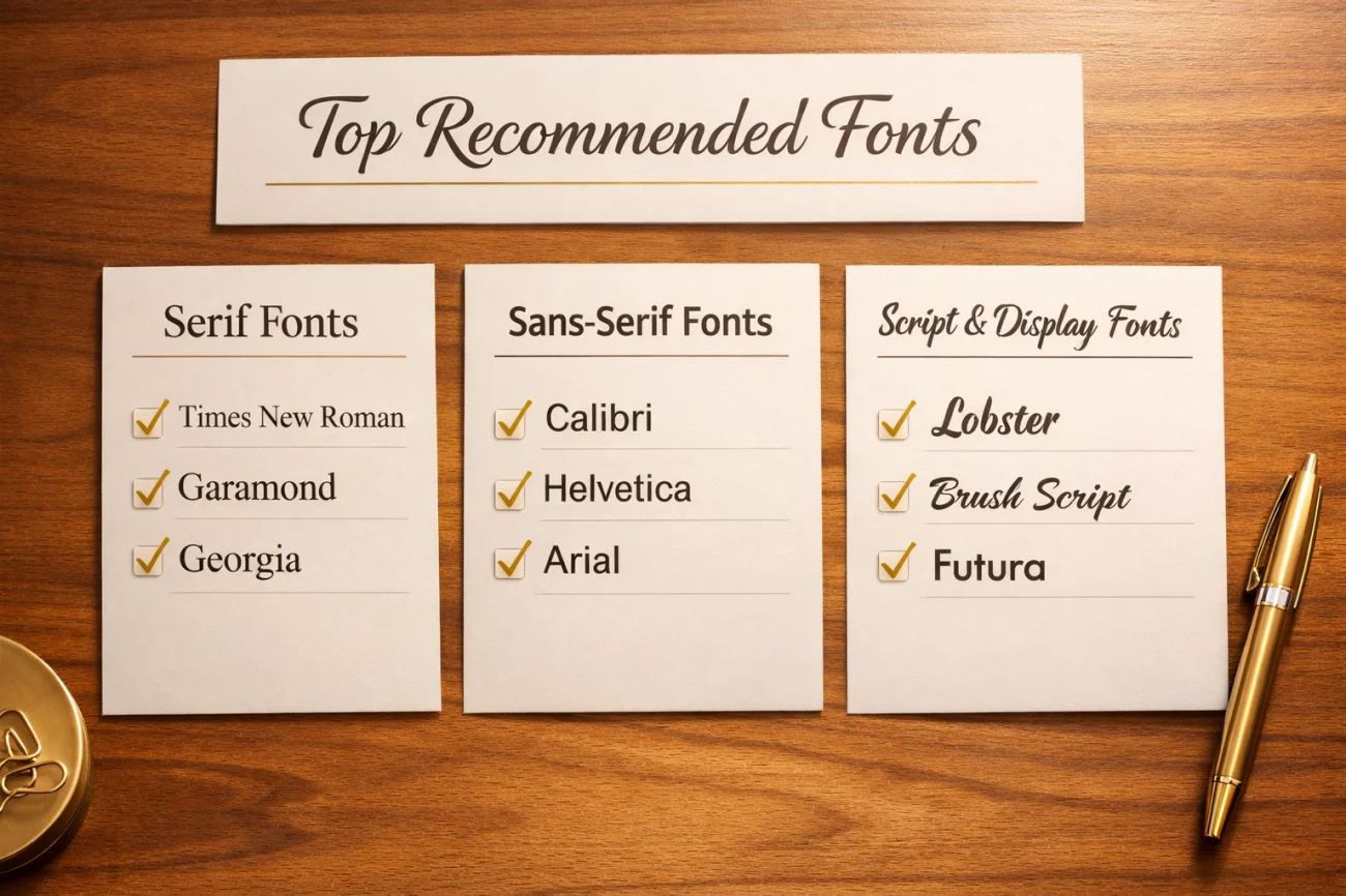
Ag Recommended Serif Fonts
The gold standard for formal business letters. Universal availability and immediate recognition make it the safest choice. Use 12pt for optimal readability.
More elegant than Times New Roman with narrower letterforms. Excellent for executives where refinement matters. Elevates letters without appearing pretentious.
Designed specifically for screen readability. Slightly larger x-height makes it easier to read at smaller sizes. A great compromise between traditional and modern.
A transitional serif with high contrast and sharp edges. It conveys a sense of intellectual authority and tradition, perfect for senior-level resignations.
Aa Recommended Sans-Serif Fonts
Microsoft’s default font. Clean, modern, and highly readable. Excellent choice for tech companies, startups, or any workplace with contemporary culture.
Slightly more informal than Calibri but completely acceptable. Universal availability across all operating systems ensures your letter looks exactly the same everywhere.
Balanced proportions and neutral appearance. Perfect for when you want typography to disappear into the background so your message stands out.
Designed with wide spacing and open letterforms specifically for screens. If you are sending your resignation via email body text, this is the safest bet.
Fonts That Destroy Professionalism
Certain fonts signal poor judgment, lack of business sophistication, or disrespect for formal communication standards. Never use these fonts for resignation letters regardless of how much you personally like them.
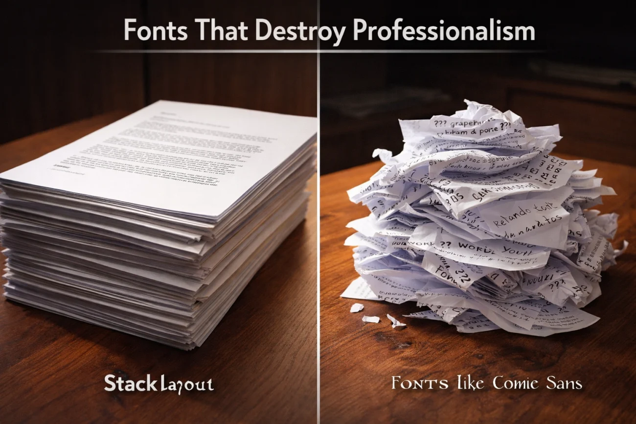
Never Use These Fonts
- ✗ Comic Sans – The most unprofessional font choice possible, associated with children’s materials
- ✗ Papyrus – Dated and associated with amateur design
- ✗ Courier New – Typewriter font appropriate only for screenplays
- ✗ Impact – Designed for headlines, far too bold for body text
- ✗ Brush Script – Decorative script font too casual for business
- ✗ Any decorative or novelty fonts – These scream unprofessional
Using inappropriate fonts for resignation letters signals you don’t understand professional communication standards. Hiring managers reading these documents question whether you can represent their organization appropriately in external communications.
Avoid Overly Creative Fonts
Even fonts that work well in marketing materials or creative portfolios fail in resignation letter contexts. Your resignation letter isn’t the place to showcase design sensibility or personal style – it’s formal business documentation requiring conservative typography choices.
Optimal Font Size Standards
Resignation letter font size affects readability and document length. Too small forces readers to strain, while too large appears childish or suggests you’re padding a thin resignation message.
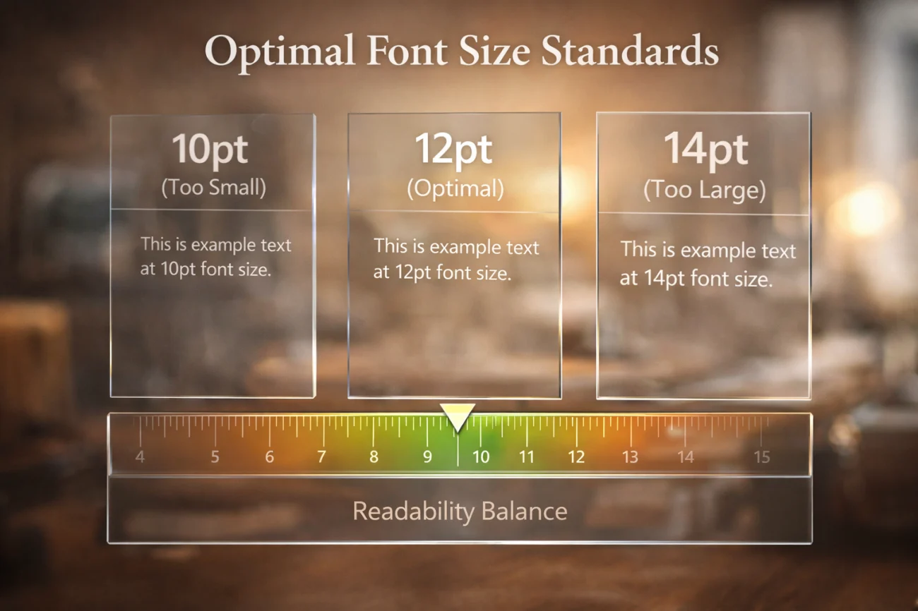
Size Recommendations by Font
- 11-12pt – Standard for Times New Roman, Garamond, Arial, Helvetica
- 11pt – Minimum acceptable size for body text
- 12pt – Safest choice, ensures readability for all ages
- 10pt – Too small except for Calibri or Georgia (larger x-heights)
- 14pt+ – Too large, appears unprofessional
When in doubt, use 12pt. This size works universally across fonts and ensures comfortable reading for managers of all ages. Younger managers with excellent vision won’t notice the size, while older managers will appreciate the consideration.
Font Sizing for Names and Headings
Your name at the top of the letter can be slightly larger (14-16pt) to create visual hierarchy. Keep this modest – your name shouldn’t dominate the page. Section headings, if used, should be 12-13pt maximum, just slightly larger than body text.
Avoid using multiple font sizes throughout body text. Consistent sizing maintains professional appearance and focuses attention on content rather than typography.
Line Spacing and Paragraph Formatting
Beyond font selection and sizing, proper spacing ensures your resignation letter looks polished and reads comfortably.
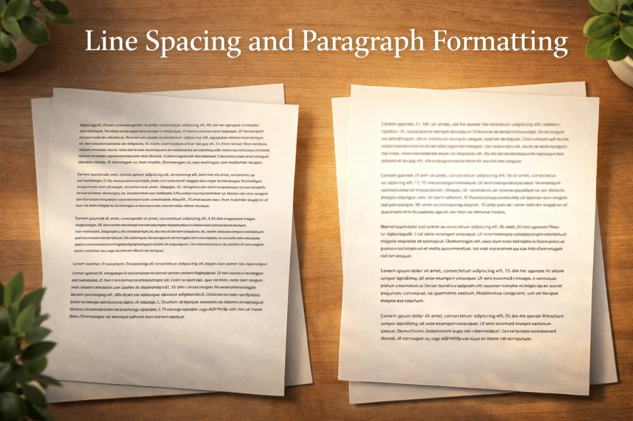
Line Spacing Standards
Use single-spacing (1.0) or 1.15 line spacing for resignation letter body text. Double-spacing (2.0) wastes space and makes one-page letters stretch unnecessarily across multiple pages. Business letters traditionally use single spacing with blank lines between paragraphs.
Leave one blank line between paragraphs rather than indenting first lines. This modern formatting approach creates clean visual separation without relying on indentation that can appear inconsistent across different word processors.
Margin Settings
Standard one-inch (1″) margins on all sides work universally. Some professionals use 0.75″ margins to fit more content on one page, but this approaches the limit of acceptable formatting. Never use margins smaller than 0.75″ – tight margins make documents appear crowded and difficult to read.
Paragraph Length Control
Keep paragraphs to 3-5 sentences maximum. Long paragraphs create visual density that discourages reading. Short paragraphs with white space between them guide readers through your resignation smoothly without overwhelming them with text blocks.
Industry-Specific Font Preferences
Different industries maintain unwritten typography preferences based on tradition and culture. Matching your font choice to industry expectations demonstrates awareness of professional norms.
Conservative Industries
Legal, financial services, government, healthcare, and insurance prefer traditional serif fonts. Times New Roman or Garamond signal respect for formal communication standards these industries value. Using modern sans-serif fonts in resignation letters to law firms or banks can appear tone-deaf to culture.
Modern Industries
Technology companies, startups, creative agencies, and media organizations lean toward clean sans-serif fonts. Calibri, Arial, or Helvetica align with these industries’ contemporary communication styles. Traditional serif fonts might seem outdated in contexts where innovation and modernity matter.
Middle Ground Industries
Education, nonprofit, manufacturing, and retail work well with either font category. Choose based on your specific company culture rather than industry-wide assumptions. If your workplace uses modern branding and communication, sans-serif fits. If they maintain traditional formal standards, serif fonts work better.
Digital vs Print Considerations
How you deliver your resignation letter – email PDF versus printed copy – influences optimal font selection.
Screen-Optimized Fonts
For email PDF resignations, sans-serif fonts render more clearly on screens. Calibri, Arial, and Verdana maintain excellent readability across devices. Recipients reading on phones or tablets will appreciate fonts designed for digital display.
Print-Optimized Fonts
For printed resignations delivered in person or by mail, serif fonts like Times New Roman and Garamond provide superior paper readability. Decorative strokes guide eyes along text lines more effectively in print.
Universal Fonts
Georgia and Calibri work equally well in both formats, designed specifically to maintain readability across digital and print contexts.
Maintaining Typography Consistency
Once you select a font for your resignation letter, use it consistently throughout. Mixing multiple fonts creates visual chaos that appears unprofessional.
Single Font Throughout
Use one font for your entire resignation letter – body text, headers, signature block. The only variation should be sizing (slightly larger for your name) and styling (bold for emphasis). Never combine Times New Roman body text with Arial headers.
Using Bold and Italic
Bold draws attention to critical information: your name, “resignation,” or last working day. Use sparingly – 3-5 instances maximum. Italic works for subtle emphasis but reads poorly in large quantities. Never underline text; it appears dated.
❓ FAQ
🔤 What is the best font for a resignation letter?
Times New Roman (12pt) remains the safest choice for all industries and situations. For modern workplaces, Calibri (11-12pt) works equally well. Both fonts signal professionalism while maintaining excellent readability without drawing attention to typography.
📏 What font size should I use for my resignation letter?
Use 12pt for most fonts (Times New Roman, Arial, Garamond). Calibri and Georgia work well at 11pt due to larger x-heights. Never go below 11pt or above 13pt for body text. Your name can be slightly larger (14-16pt) for visual hierarchy.
✍️ Should I use serif or sans-serif fonts?
Serif fonts (Times New Roman, Garamond) suit conservative industries like law and finance. Sans-serif fonts (Calibri, Arial) fit modern industries like tech and creative agencies. When uncertain, Times New Roman at 12pt works universally across all contexts.
❌ What fonts should I never use in resignation letters?
Never use Comic Sans, Papyrus, Courier New (except screenplays), Impact, Brush Script, or any decorative fonts. These choices signal poor professional judgment and distract from your resignation message. Stick to standard business fonts that maintain neutral professionalism.
📱 Does delivery method (email vs print) affect font choice?
Yes. Sans-serif fonts (Calibri, Arial) render better on screens for email PDFs. Serif fonts (Times New Roman, Garamond) read better on printed paper. Georgia and Calibri work well in both formats, making them safe choices when unsure how recipients will view your letter.
Final Thoughts
Your resignation letter font creates immediate impressions about your professionalism before anyone reads your actual resignation content. The right typography ensures readability while signaling respect for business communication standards that employers expect in formal documentation.
Choosing the best font for resignation letter means selecting typography that disappears into professional neutrality rather than drawing attention to design choices. Times New Roman, Calibri, and Arial work precisely because they’re familiar, readable, and universally accepted across industries and company cultures.
Typography might seem like a minor detail compared to your resignation letter’s content, but these presentation choices accumulate to create overall impressions of judgment and competence. Professional font selection at appropriate sizing demonstrates the same attention to standards that characterized your work throughout employment, maintaining positive reputation through your final documentation.
⚠️ Legal Disclaimer: The resignation templates, email samples, and professional guidance provided in this guide are for informational purposes only and do not constitute legal advice. Employment laws and contract requirements vary by jurisdiction and individual circumstances. Please review your employment agreement and consult your HR department and/or a qualified attorney to ensure compliance with applicable laws and policies.